Types of graphs and their usage / Where to use graphs / Chart-Graph Matching Guide
⦁ What is data visualization?
Data visualization is the graphical representation of
information and data using visual elements such as charts, graphs, and maps.
The goal of data visualization is to make complex data more easily
understandable and accessible to people. By using visual aids to present data,
patterns and relationships that might not be immediately apparent from raw data
can be made more apparent. Data visualization is an important tool for
businesses, researchers, and individuals who need to analyze and communicate
data effectively. It can help identify trends, patterns, and outliers in large
datasets, and can help to communicate insights and findings to a wider
audience.
⦁ Data
visualization is important for several reasons:
Facilitates understanding: Visual representation of data
helps to make complex information easier to understand and interpret. By
presenting data in a visual format, patterns and trends can be quickly
identified, allowing individuals to draw insights and make informed decisions.
Provides clarity: Data visualization provides clarity to
large and complex data sets, making it easier to see relationships between data
points and identify outliers. This can lead to more accurate analysis and
interpretation of data.
Enhances communication: Visualizing data enables
communication of complex information in a clear and concise way. This makes it
easier to share insights with others, and to convey data-driven recommendations
to decision-makers.
Enables quick decision-making: By providing a visual
representation of data, data visualization helps decision-makers to quickly
identify trends and patterns, enabling faster and more accurate
decision-making.
Supports data-driven culture: Data visualization supports a
data-driven culture in organizations, by making data more accessible and easier
to understand. This leads to more informed decision-making and can help to
identify new opportunities and challenges.
Overall, data visualization plays a critical role in making
data more accessible, understandable, and actionable, which is essential for
decision-making, problem-solving, and innovation.
⦁ Types
of graphs and their usage:
Choosing the right type of graph for a particular task is
important to ensure that the data is presented in the most effective way. Here
are some guidelines to help you choose the right type of graph for different
tasks:
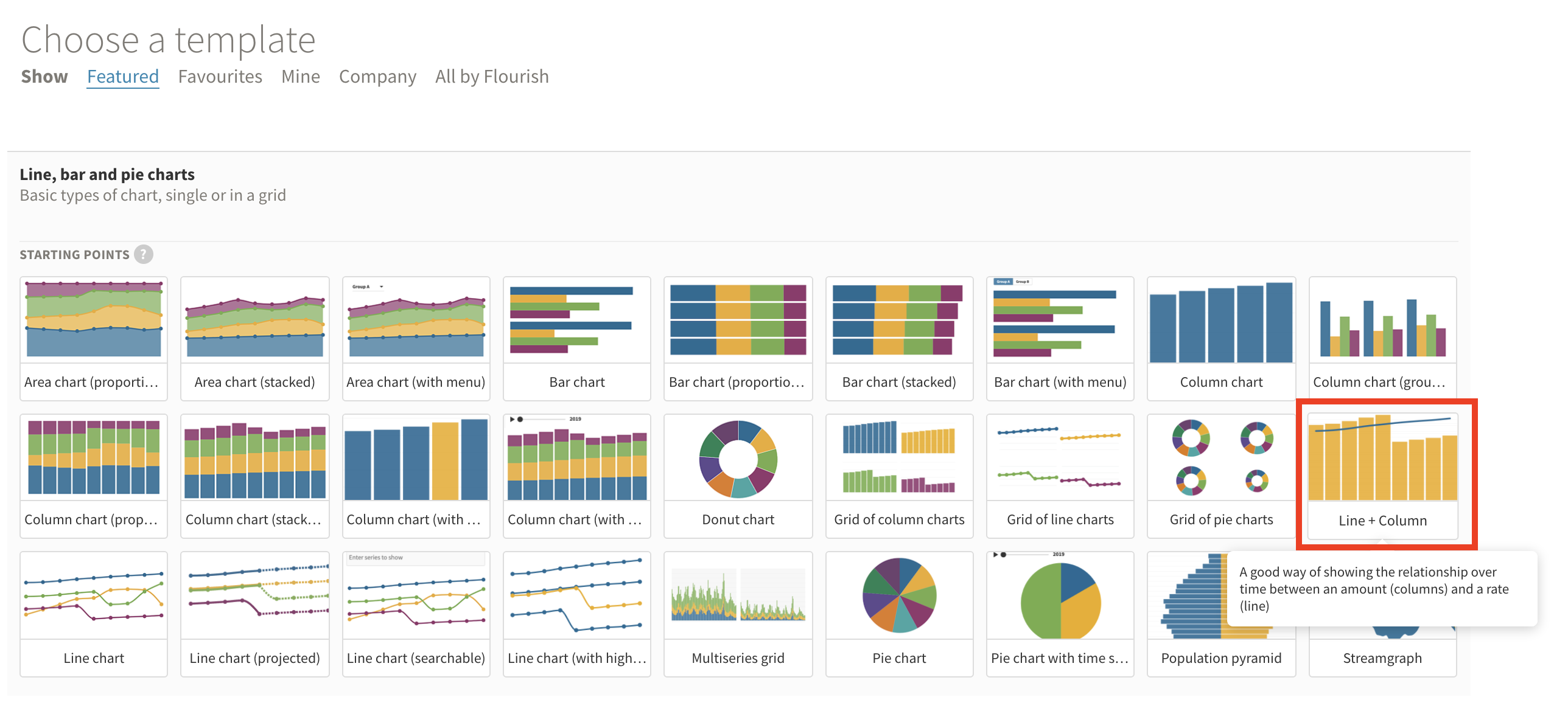
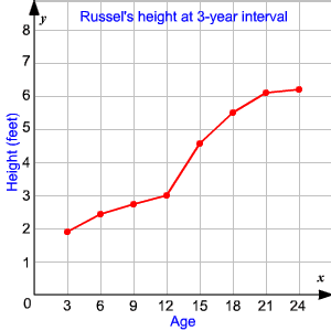
1) Line
graphs: Use line graphs to show trends over time or to compare multiple
trends. Line graphs are ideal for showing continuous data, such as temperature
or stock prices.
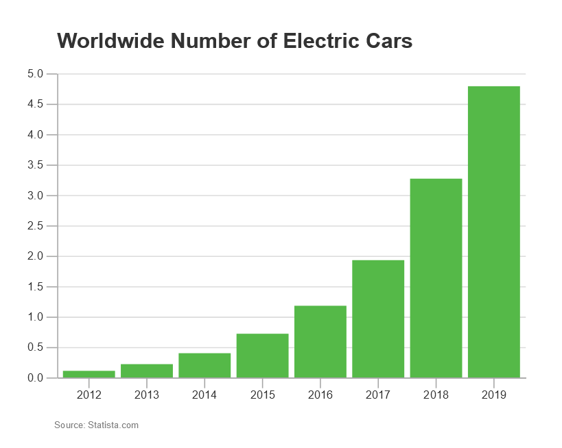
2) Bar
graphs: Use bar graphs to compare data between different groups. Bar graphs
are ideal for showing discrete data, such as the number of customers in each
age group.
3) Pie charts: Use pie charts to show how a whole is divided into parts. Pie charts are ideal for showing percentages or proportions.

4) Scatter
plots: Use scatter plots to show the relationship between two variables.
Scatter plots are ideal for showing correlations or patterns in the data.

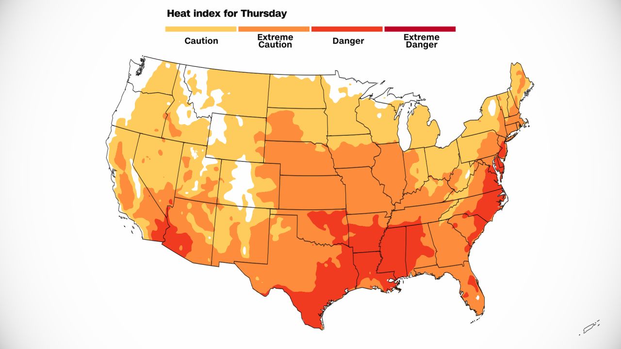
5) Heat
maps: Use heat maps to show the density or distribution of data across a
range of values. Heat maps are ideal for showing trends in large datasets.
6) Box
plots: Use box plots to show the distribution of data and identify
outliers. Box plots are ideal for showing the range, median, and quartiles of a
dataset.
7) Area
charts: Use area charts to show changes in data over time and to compare
multiple data sets. Area charts are similar to line graphs but are filled with
color, which makes it easier to see the difference between the lines.
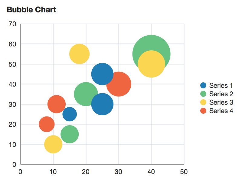
8) Bubble
charts: Use bubble charts to show the relationship between three variables.
Bubble charts use circles of different sizes to represent data points, making
it easy to visualize the relationship between the variables.
9) Histograms:
Use histograms to show the frequency distribution of a data set. Histograms are
similar to bar graphs, but instead of comparing data between different groups,
they show the distribution of data within a single group.

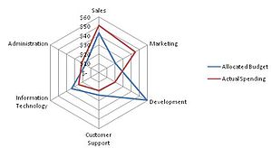
10 Radar
charts: Use radar charts to compare multiple data sets with multiple
variables. Radar charts use a spider web-like design to show how different data
sets compare on multiple variables.
11 Waterfall
charts: Use waterfall charts to show how a starting value is affected by
positive and negative values. Waterfall charts are useful for illustrating
financial data, such as changes in revenue or expenses.

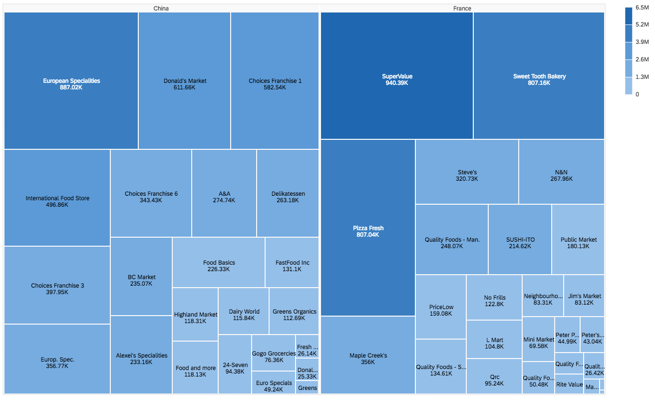
12 Treemap
charts: Use treemap charts to show hierarchical data as a series of nested
rectangles. Treemap charts can be used to compare the relative sizes of
different categories within a dataset.
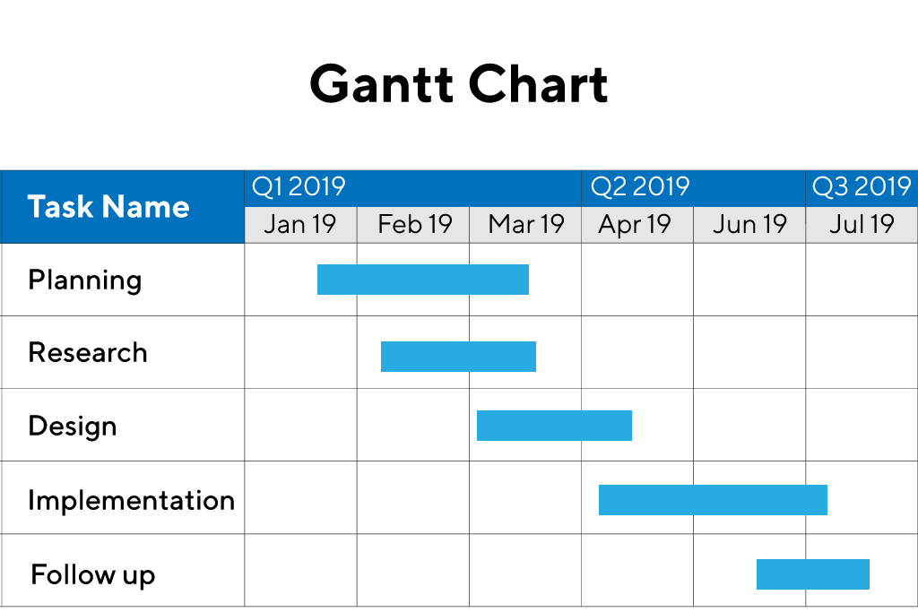
1 Gantt
charts: Use Gantt charts to show the timeline of a project and the progress
of individual tasks. Gantt charts are useful for visualizing complex projects
with many different stages and dependencies.
1 Polar
charts: Use polar charts to show how data varies over a circular range.
Polar charts are similar to radar charts but show data in a circular rather
than a spider web-like design.
1 Sankey
diagrams: Use Sankey diagrams to show the flow of data or information
between different stages or components. Sankey diagrams can be used to
illustrate the flow of energy, traffic, or money.
1 Bullet
charts: Use bullet charts to show progress towards a goal or target. Bullet
charts are similar to bar graphs but include a target or goal line and shading
to indicate progress towards that goal.
1 Funnel
charts: Use funnel charts to show the stages in a process, such as a sales
pipeline or a marketing campaign. Funnel charts use a series of decreasing bars
to show how many people or items are lost at each stage of the process.
1 Tree
diagrams: Use tree diagrams to show the hierarchical structure of a dataset
or organization. Tree diagrams use a branching structure to show how different
categories or subcategories are related to one another.
1 Word
clouds: Use word clouds to visualize the frequency of different words in a
text or dataset. Word clouds use varying font sizes and colors to represent the
frequency of different words or phrases.
2 Scatterplot
matrices: Use scatterplot matrices to show the relationship between
multiple variables in a dataset. Scatterplot matrices use a grid of
scatterplots to visualize the correlations between different variables.
21 Waterfall
charts: Use waterfall charts to show how a value changes over time or
between categories. Waterfall charts show how the starting value is affected by
positive and negative values, making it easy to see how changes in one category
impact the overall value.
22 Network
graphs: Use network graphs to show relationships between multiple entities,
such as people or organizations. Network graphs use nodes to represent entities
and edges to represent connections between them.
2 Polar
area diagrams: Use polar area diagrams to show the distribution of data
across a circular range, similar to a pie chart. Polar area diagrams use
different sized areas to represent the size of each data point.
2 Violin
plots: Use violin plots to show the distribution of data across a range of
values. Violin plots combine a box plot with a kernel density plot to show the
shape of the distribution of data.
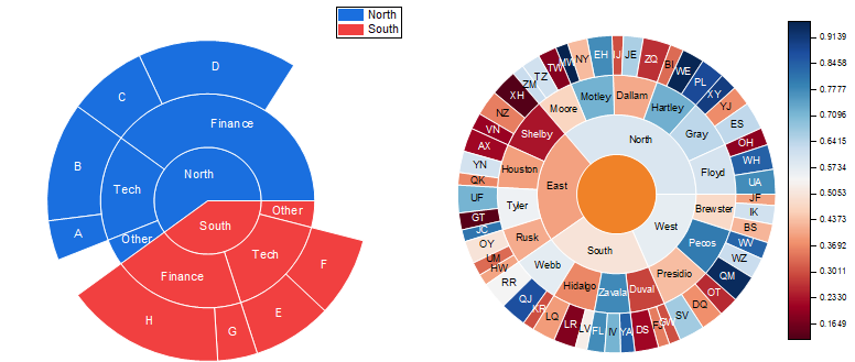
2 Sunburst
charts: Use sunburst charts to show the hierarchical structure of a dataset
or organization. Sunburst charts use a circular design with nested rings to
show the relationship between categories and subcategories.
2 Choropleth
maps: Use choropleth maps to show data as a color-coded map, where each
region or country is shaded according to the data values. Choropleth maps are
ideal for showing data that is aggregated by administrative boundaries, such as
countries, states, or provinces.

2 Proportional
symbol maps: Use proportional symbol maps to show data using symbols of
different sizes, where each symbol represents a specific value. Proportional
symbol maps are ideal for showing data that has a wide range of values and can
be visualized as symbols, such as population or economic data.

2 Dot
density maps: Use dot density maps to show data using a series of dots,
where each dot represents a specific value. Dot density maps are ideal for
showing data that is evenly distributed across a geographic area, such as
population density.
2 Cartograms:
Use cartograms to show data using a distorted map, where the size or shape of
each region or country is proportional to the data values. Cartograms are ideal
for showing data that is not evenly distributed across a geographic area, such
as economic or environmental data.


Comments
Post a Comment
datapedia24@gmail.com